Friday 21 December 2012

Portfolio Visit 2

I then got in touch with Karen Wilson, from Paper Salad, who I was recommend to me by Phil my Guru, as I told him a was interested in stationary and cards.
She said the following;

Hi Katie,

Yes,  you could send us a pdf, you could come in to see us but you would have to leave it until after the trade shows, maybe the beginning of March.  We are extremely hectic at the moment and I know it sounds stupid but every minute of the day is spoken for before then!

Kind regards


Karen

I sent her my PDF version of my portfolio but unfortunately it was too late to hear her response.
I will definitely arrange a portfolio visit with her in the new year because paper salad seems like a fantastic and interesting company, and it really appeals to me.  And I think that I will have worked on my portfolio more by then so it will be a much better experience. 

Portfolio Visit 1

Over the past two weeks I have emailed numerous artists and designers to take a look at my portfolio, as alot of the people I emailed have stalls and markets around christmas so they were too bust to see me.
I had two replies one from &made in the Craft Centre in Manchester who I emailed a PDF version of my portfolio to get some feedback and advice on.
Here is what she said;


Hi Katie,
I've had a look at the images you've sent but I feel that I would be doing you, and your work a disservice to make any comment without us talking through it together or without additional information to help me to understand the brief you were working to, the customer profile or the intended use; final end product that your designs are for.
Don’t be too disappointed in my response, I’m sure your tutor will understand my point of view – maybe we could try again after Christmas – if that isn’t far too late.
Have a lovely holiday Katie -
Andrea

I also got in touch with Helen Smith, Jessica Owen, Andrea Lord. I arranged to see Jessica Own some time in the new year. 

Thursday 20 December 2012

Website Research

At the start of the year we were told that we will be designing and producing a website, to promote our work and be more professional to potential visits and even clients. So I started to do some research to look at layouts, the flow and function of a website, as this is important because it can be the first glimpse of your work to potential clients and visits, it should represent you and your work.
The main features that I noticed to create a good website are:
1. Make the sight easy to navigate, theres nothing worse than loads of links, it's too busy and confusing
2. Not too much text, too much text could be boring, too much and overwhelming for the eyes to look at
3. Keep website up to date, theres no point having old work, you should show your busy and working hard
4. Keep it simple, this is something I have definitely taken note of, I have currently changed the background and colour scheme of my blog
I have looked through a lot of artists website and think that you always remember the artists who have amazing website because they stick in your mind. 
Here are some examples of artist's websites that have caught my attention; 

One artist's website that has inspired me is Julia Rothman an illustrator and pattern designer, her website opens with a clean white background, a simple mixture of different texts on the left of the site. All of the links are organised into different categories e.g her illustrations, pattern, and books. There is also a slideshow of a variety of different works in the centre of the site, this is a brilliant idea because it gives the viewer an idea of the wide range of different products and surfaces that she works with. 


Another feature of her website that I thought was a good idea was to include photographs of her sketchbook, I think that this is a great idea as it shows a more personal side to the artist, and shows the ideas and thoughts that may have sparked ideas for work and collections. 
I thought that Julia Rothman's website is bright, clean and fresh, with amazing photography, simple layout that is easy to navigate around, and shows her work at it's best.

Another artist's website who I have found a good source of ideas and inspiration is Rob Ryan , a paper cutter and screen printer. As you can see both websites have a similar layout, both have a large image of their work, and both have a list of links on the left of the site. However I think that this website really shows Ryan's character and the personality and style of his works, by having the birds, leaves ect as the links, I think that this is a charming and fun way to show the work and also be a link. 

The website also included links to his blog, which is another way to promote yourself and your work, keeping people regularly up to date. It also included links to collaborations, other works, about, contact details, and commissioned works, this is a good showing people a range of different projects that you have worked on in the past. 

This exercise has helped me to look at layouts, ideas and think about what features I want on my own website in the future, it has also made me make changes to my blog and will also look to improve further in the near future. 

BMW Warm Heart Foundation

Over the past couple of months I have been working on BMW warm heart foundation brief. The foundation has been set ip by BMW to provide funding and support for educational, environmental and Cultural Heritage projects. They would like the designs to portray uplifting and positive themes such as, hope, light, role models, looking up to elders, growth, helping, caring, realising dreams ect. I decided that I would focus on growth, caring and light, so the first images that came to my head were plants and flowers. We were told that we should create a certificate, thank you/new year card and two of the following; bag, scarf, keyring, iPhone case, mug, t-shirt.

I decided that I would start by looking at colours, as this is an important part of chinese culture and art, as different colours portray different things, such as yellow is sunlight, and growth and harmony, so I knew that this would be a good colour to chose as it goes with my themes. 
I then decided to look at flowers and plants as this would be the main image of my chosen theme. I found that sunflowers mean New Year, and yellow is a good colour. Bamboo is also a popular plant and is often symbolised with China and Chinese culture. 
I then started to draw sunflowers drawn from life, so I could draw from different angles and viewpoints. Next talking my initial drawing as inspiration I then started to break down the shapes and simplify the drawings, as I wanted to turn them into stamps. 

Drawing with Black Fine liner 
Stamps

I then wanted to look at backgrounds, and it was suggested by one of my tutors to try collage, collage is something that I have always been interested in and have produced in the past, however I have stopped making them over the past couple of years. I dived back into collaging and have definitely caught the collage bug again.


Here are a couple of the collages I made to create backgrounds with, I used paper, card, painted papers, and printed papers using silk screen printing. I knew that I wanted the colours of the backgrounds and the stamps to compliment each other, but also so the stamps stand out from background. I decided that I would stick to a colour palette of greens, yellows and blues so everything would compliment each other well. 

I then went on Photoshop to put the two components together. 
Certificate 

Tote Bags

Overall this has been one of my favourite briefs to date, although I was quite slow to start and get all my ideas and thoughts together, I was really pleased with the style, techniques, and the final outcome. I think that I have learnt a lot from this brief, most of all to sort my ideas out first, rather than going off and drawing any old think/flower and drawing lots of unnecessary things, it would be much better and much more productive if I got all my ideas and thoughts together first. I have also found an interesting way of working and feel as I could take this further and develop it more in the future. 

Tuesday 18 December 2012

Comment & Content or Decoration


Are illustrators and Surfaces Designers merely space fillers? Can they, should they and are they allowed to make comment on matters such as economics, social and political issues or moral and philosophical debates. As a practitioner do you even care? 

I think that this comment relies on the artist themselves, and their own personal views and opinions and style of art. Some artists may feel very strongly about issues such as economics, social and political issues and include them in their work, whereas other artists/designers may be interested in these matters but may not want to include them in there work as it may be too controversial. 
When I think of political, social and philosophical art I tend to think of graffiti art because graffiti art is a way of artists to show their views and opinions to a large audience, in a public place. I also tend to think of fine art as a way of artist's expressing their opinions and social issues, that sometimes may be seen as controversial to some viewers. 

I also think the matter is different for illustrators and surface designers, I think that surface designers sometimes have to be more commercial as their designs are being put on products bought by the public such as cards, stationary, fabrics and home furnishings, so it would be too controversial to include matters such as politics and social issues. I think that surface designer's work can still be meaningful and have depth behind it but it would be less obvious and more viewer freindly. Whereas illustrators may be asked to illustrate a newspaper or article where illustrations like these may be appropriate for the content, then they can comment on more controversial issues. 

Although I haven't seen many surface designer's work who use political, social and economic issues in their work, I have come across the work of Timorous Beasties, a contemporary duo who create beautiful and intricate wallpaper and fabric designs. Once described as William Morris on acid, they have included controversial issues in their work, however have done it so it isn't noticeable and when noticed is a humorous spin on a classic style and technique of wallpaper. 


Toiles are a classic style of wallpaper from France in the 1770's, they depicted peaceful and romantic scenes of people having picnics by a lake, couples, flowers and beautiful scenery. However Timorous Beasties have taken the idea of a classic Toile and turned it on it's head by instead of beautiful landscapes they have included a modern landscape of London's most famous landmarks, such as Big Ben, London Bridge, and the Gherkin. Instead of couples sitting in an idillic park having a picnic Beasties have included a sinister and dark reinterpretation  of modern life that includes junkies, prostitutes, tramps sleeping in the park, and even a young lad peeing against some bushes. 
The wallpapers have caused controversy and split people's opinions, some people see the wallpapers as highly offensive and have stereotyped races, whereas some people have seen the humour and playfulness that Timorous Beasties had intended this collection to be. 

The collection has been seen as controversial as parents who bought the wallpaper to decorate their child's bedroom with had to return it after closer inspection (Article). 
It has also been torn down from GPB26m arts complex in London, it was built to celebrate the east end's cultural diversity and found that they wallpaper contained inappropriate and insensitive racial stereotypes. Oona King the faculties chair woman said ''It's important for artists to have some freedom of expression and I don't sanction each and every artistic decision before it's made. But as chair of Rich Mix, I cannot allow the image to be the defining image."(Article)

I think that artists and designers should have the freedom to include their opinions and views in their work, and I admire people who include these matters in their work, however it is not something that I would do myself. Although I want to have more meaning and depth in my work I wouldn't want it to be seen as off-putting and offensive as this would not be the audience my work would be aimed towards. 

Monday 17 December 2012

Hopes, Fears and Opportunities

This September we were asked to write about our hopes, fears and opportunities, in a blog post. At first I found it a difficult and overwhelming process, but is something that I have to face up to if I want to get through my third year, and have a career in design.

Hopes

My hopes all throughout college, foundation and the first two years of university have always been to find a style, a style of woking that when you look at it, it says that's Katie's work. I am starting to feel myself steering towards a specific style but I'm not one hundred percent there yet. Thankfully the tutors have helped me to pick up on the good points of my work, methods of working/creating that I should really explore more and focus all my attention on. To become more focused and not wonder around hopelessly drawing and doing unnecessary things.
I also want to become more confident in ''selling'' my work to others, to be able to talk about it more confidently and freely and not doubt myself or my abilities.
I also want my work to have stronger sense of theme or narrative, instead of just looking 'nice' or 'pretty', to have more meaning and substance behind it.  

Fears

My fears have always been running out of time, with art and design you never truly feel as you have finish, 'maybe I could do one more sketch, or write a bit more, or I wish I would have made another mood board.' And with every fished brief I'm sat on the train on the way home thinking and wishing I had done a list of other things.
Another fear is not being about to go out into the tough world of art and design and be able to do it myself, ever since school I have always had a tutor guiding you through, helping you, and inspiring and helping your ideas grow. What if when I finish I can't keep up or be able to work without help and guidance. What if I cant come up with imaginative enough ideas by myself, if they don't have enough substance.
Another fear is the portfolio visits, I think that for the initial few I will be nervous, but when I feel as my portfolio is more professional and stronger I will be more confident. I always feel nervous about showing tutors and my peers my work, I have always found criticism difficult and to be told by a tutor who I know is bad enough, but being told by someone who you admire and who is a professional designer/artist is even worse. However I have faced that criticism is good is good thing, life would be boring if everything piece of work was perfect.

Opportunities

As I love to make things, I would love the opportunity to sell my work, in a stall or at a market,  the feeling that someone has liked my work so much they have decided to buy something that I have spent time making, I think that this would be a great confidence booster.
I would also love to actually put my work onto products, I had started to experiment with this at the end of last year by making pencil cases, note books and cards, however I would love to have the opportunity to explore this more in the final project. I think that the work looks completely different when it has been put on products, it seems to have more character and charm, rather than just flat on a piece of paper.


Friday 23 November 2012

Lotta Jansdotter

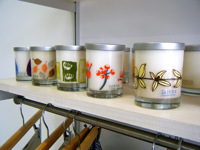
One of the Surface Design group had arranged a visit to see Lotta Jansdotter's Studio and Shop in Brooklyn. Unfortunately Lotta couldn't be there as she was away with business however the shop manager was there to talk to us, answer any questions and talk us around the studio and shop.


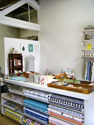
The shop space was clean, fresh and had an exciting atmosphere, it was painted white so that all the colours and patterns of the products stand out from the bright white backgrounds. 


I really loved the simple and fresh patterns of her work, the patterns were bold, but also mixed nature and organic shapes with the bold shapes. I think my favourite pieces of work were the blue/teal collection (above). I really loved the colours, the mixture of blues and the clean white, with a mixture of bold shapes and organic shapes. 
I was really inspired by the way the work was presented in the shop, as I want to make things and put my designs onto products in the final year I got lots of inspiration and ideas from, as sometimes I think that it is difficult to place and arrange difficult objects like these, as sometimes it can become too over crowded and cluttered, making it look messy and unprofessional. However I really liked the mixture of objects on tables and then things on shelves above.  
The studio manager told us that because she creates things now on such a large scale that she no longer does all the printing herself instead it is done offsite, however if she is sampling or coming up with ideas then she will screen print herself. 

I found the studio to be really inspirational too, there was no real separation between the shop and studio, I thought that this was really interesting and something I have never really seen before, to this scale. I found it really sweet how her aprons, stamps and screens had been left out as if she had been working there only a few hours ago. 


Stephen Byram

Also on the first full day of New York we went to the house of Stephen Byram in Jersey. He was so welcoming and friendly letting us into his house, and to see some of his older works and some of his most recent works.
He has a variety of different styles and techniques, collage, line drawing and some abstract works, what I really found interesting was that a lot of his work has been used on CD covers, I thought that this would be an amazing feeling for an artist to see their work on a CD. He had placed some of his CD covers, posters and other works around his house for us to pick up and look at/through and didn't mind us taking photo's of his house and work. He said that in some ways he has moved on from the CD covers because they don't have the same feel to them any more because of the internet, downloading and iTunes, as the picture is so small and tiny on an iPod people don't care anymore or take the time to look and appreciate the work and attention that goes into music/album artwork.


His studio in the basement

In some of his more recent works he has moved onto 3D sculptures made from found objects and recycling materials and objects (mainly wood) to create something new and exciting. He seemed really excited and proud talking about his new works as they are so different and refreshing from his work for CD's. He calls himself a graphic designer, however he seems to have so many layers to his works, in some works he is definitely a graphic designer looking at typography, shape and layout, in some ways his works look like an illustrator and painter and then in others you can see the sculpture 3D elements in his creations, all really interesting and appealing.

The Invisible Dog/ Andre Da Loba

On our first full day in New York we got the subway to Brooklyn to visit the Invisible Dog Art Centre.   We were welcomed by Andre Da Loba, (one of the artist's who has a studio space there.)
We started by looking around the current exhibition, by the duo Steven and William. The Art Centre was an old factory/mill that use to make jewellery, and belt buckles, so when the Art Centre was made a lot of objects were left there, so many of the works were made by recycling this unused and found items. 


There were also some wonderful repeat patterns and drawings another room, (I think that they were by the same people, although they seem completely different from their other works). But as I am a surface designer they really caught my eye, because of the repeating patterns, the simple colours in the background, and that there were multiples of the same thing (my favourite). 


Andre Da Loba 

Once we had looked around the exhibition of Steven and William, we then went upstairs, in a huge old lift, which said 'Danger' all over it (not very reassuring), and went to see some of the artists studio's. A real privilege as I think that many artist's and designers are private and secretive when it comes to their studio spaces.
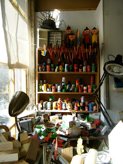
Andre's studio was amazing and inspiring filled with his work, objects and artefacts that he has collected over the years. What I found interesting was he about of colour and variety in his works, from 3D and sculpture to drawings and prints. I really made me think about my own studio space and how I should make full use of the amount of space I have while I am still at Stockport.
It has also made me think about the importance of a studio space and how it is a place where an artist can escape from their houses and bedrooms too, and it should be a place of randomness and artistic mess and chaos.


The works that I really liked was the prints/paintings of the houses and buildings, I thought that they were beautiful each once a different colour, shape and size. 

New York!


It has taken me a while to write this post, but I think that I have just about recovered from the amazing and thrilling and jet lagged experience of our last residential trip with Stockport College to New York, somewhere I have wanted to go since being young and seeing the Big Apple in films and photographs.

After a 16-17 hour journey from Manchester to London and then finally New York JFK airport we had arrived, we drove over a bridge to Manhattan and saw the wonderful, picture perfect famous skyline lit up and gleaming in the darkness.
It still doesn't even feel real that I have actually been there and tick it off my bucket list, I saw all the wonderful sights, Times Square, went to the top of the Rockefeller Centre, The MOMA, and The Metropolitan, went to Jersey, Brooklyn and Manhattan, all squeezed into four days. 


The trip was amazing and so eye opening to what life as an artist/designer can be like, I found all the advise we were given to be really useful and inspiring, and in some ways has made me more determined to become one myself, as I still don't have the confidence nor do I see myself as a designer yet. I found all of the artist's/designer's and people of New York to be so friendly, warm hearted and welcoming, (in some cases even letting nearly 30 students to have a nosey around their own house).
I would definatley love to go back in the future, however I don't think that it would be the same without Stockport College, all the hard work and organising, and the amazing studio's and people they had arranged for us to see and meet were so amazing and a once in a life time opportunity, that I will never forget.