Wednesday, 5 September 2012

Artist Research and Inspiration

To start the brief I wanted to do some artist research to get ideas and inspiration from. Although some of these artist don't look at the same subjects/themes that I want to look at I still admire the style of drawing, and want to translate these styles into my own work.

Julia Rothman

Love the use of line and also the story the images tell. 

Matte Stephens


A beautiful use of colour, each building has it's own personality and charm. 


Kathryn Edwards 


Interesting use of line, colour and also text. 

Sara Midda 


Use of water colours, her images show her travelling and a story. Also how she draws the same subject/theme but in different styles. 

The Drawing Machine


I came across this group of artists by accident and loved the mixture of 3D and drawing, and would really like to incorporate 3D into my own work as this is something that I've never looked into before and thought that it would fit into this brief well.




New Year, New Project

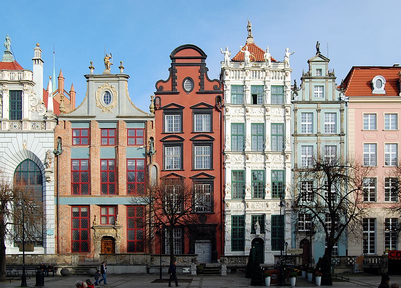
As I move into my third year of University I was given a choice of five briefs I found it difficult to choose one, at fist I was draw to one about the relationship between man and animals, but then for a little inspiration I started to look though a sketch book I had filled with photographs and sketches from the University trip to Poland and was immediately drawn to the old, tall and unusual buildings. So decided on the Le Flâneur brief, as I thought that this would be best for my ideas.
Le Flâneur is a French word, which literally means the stroller, the dawdler. 

For my work I want to concentrate on older interesting buildings often found in Europe, such as Poland, France and Italy, for research unfortunately I cannot visit these places, but have photo's from Poland and can gather more from the internet and books. I love European townhouses, each one painted different colours, each one with different styles of windows and doors and each one unique and  different form each other. 


Ideas:
  • Instead of doing detailed, intricate drawings I want to do simple line drawings, using a fine liner, fountain pen and continuous line drawings. 
  • Last year I became interested in watercolours and want to translate this into this brief. 
  • Drawing one area of the building, such as a window and draw different shapes, styles and sizes repetitively. 
  • Look for interesting smaller parts of building such as different types bricks, letter box, door bells or door numbers. 

Wednesday, 9 May 2012

Contact with Industry

I emailed Howkapow to get feedback on my work and found them really pleasant and approachable and definitely someone who I would contact in the future for some feedback on my work. I came across the work of Howkapow when we got had a brief to create some designs for them and their website. When looking at their collections online I thought that they were fun and creative and gave me lots of insertion, because a lot of their collections include folk art and tales, which is something that I have been really inspired for in my latest personal passions brief. 
In my email I sent a photograph of some drawings and other work: 


+ "Your skeletons have lots of character but are more cartoonish and so therefore probably best suited to greetings cards where you can really express lots of character"

+ "Your flower pattern is a lot more commercial. I like the application on the different paper stock but I would recommend you trying them on different textiles and surfaces to see how they work. I.e. cotton from a tea towel, ceramics, wood trays."

+ "Play around with colour and fill in your flower pattern also - see how the bottom two work as repeating and / or tesselating patterns and see whether once again you can apply these to a range of different products and materials."

I thought it was great that she thought that my work would look good on greetings cards as this is something that I have been really passionate about and decided that I want to take it further into next year. 

Contacts With Industry

As part of my second year I had to contact an artist/designer/company who I really admire and inspires my own work, and get constructive feedback from them about some of my work that I send to them over e-mails.
I contacted:
Howkapow- An online shop, (textiles, kitchen ect) 
Belly Button- Greeting Cards Company


Mandy Trolley- Cushions, Embroidery


Michelle Brand- Recycling artist


Saturday, 5 May 2012

Jessica Hogarth

I was going some research into stationary and surface design and I came across the work of illustrator and surface designer Jessica Hogarth , based in the UK. Her beautiful and playful illustrations have been used on tea towels, mugs, cards and framed pictures, and include bikes, boats, animals and houses. I carn't believe that she is only two years older than me and also graduated two years ago and she has already worked for a big Manchester based company and now works freelance and owns her own deign company.
I thought that her designs were really eye-catching and beautiful, I think that I was most drawn to her drawing style, the use of line, a this is how I like to draw myself.
Here are some photo's;


Friday, 4 May 2012

Claire Coles

I first came across the work of Claire Coles on my art foundation year a couple of years ago and have since been inspired and adored her work. She creates beautiful bespoke embroidered wallpapers, all of the wallpapers are handmade. Vintage wallopers are turned into something new and interesting, cutting the wallpaper into different shapes and then sewing them together to create beautiful and interesting wallpapers. Lately Coles designs have been turned into greeting cards.
Here are some photo's;


Claire Coles (Website)

Blue Eyed Sun

Blue Eyed Sun is a greeting card company who specialise in hand made and high end greetings cards. I really like their card collections because of the mix of different typography and text that they use. I also find the company inspiring because the use of sewing and fabrics, (seen in the photo's below), I think that using a mixture of different patterns and fabrics makes the cards more interesting and individual, making the card more personal and special for the recipient. I also love the bright and cheerful colour palettes that they use for their cards.
Here are some photo's;


Blue Eyed Sun  (Website)