Wednesday, 1 May 2013

My FMP

I have been interested in folk art for the past few years and explored it for the personal passions brief last year when I looked at Mexican Folk art. So I knew that for my final project I wanted to explore folk art further. I wanted my work to have a direction and theme, so I thought about basing it around a story, at first I found it difficult to find a story as there are so many to choose from all over the world. I was given some advice to choose maybe a British Folk story as European stories are so popular have have been used a lot in design over the past few years. I was given a British story book and narrowed the hundreds of stories down to a few about nature and animals because I knew thats what I wanted to focus on. I finally decided on a story called the 'Grocer and the Parrot'. The story involves a parrot that is kept in a cage in a grocers, the parrot doesn't speak, squark or say anything, until the parrot sees the Grocer meddling with the products in the shop. The grocer then strangles the bird and then throws him away, because she is loosing him custom, however it turns out the bird isn't dead, then flies away.

To start my work I did some research on green parrots, as this was the bird described in the story. As the story doesn't specify what type of bird, just that it is a green parrot, I felt that I would have a large range of different types of birds to draw from. I did some research online and also went to different museums and galleries to look at birds in person, to see the colours, textures, and patterns. I took some photographs and did some quick initial drawings. I also went to the Natural History Museum in London too and did the same there, so I had a selection and range of birds to draw from.
Once I had my research I then decided to create of range of drawings using different materials and techniques to create different lines, and marks. I liked the outcome and thought that I had really challenged myself and went out of my comfort zone when drawing and didn't use my usual black fine liner. I think that this range of drawing styles has really developed my drawing style and will make my work more interesting.


Because the colour of the bird is mentioned in the tale and is also a memorable part of the story, I thought it was important to included the colour of the parrot in my work. So I photocopied some of my favourite drawings and painted them using watercolours, just to jet an initial idea of colour ways, and to see how they would look in colour instead of the original black and white.


Hopes, Fears and Opportunities Part 2

In the first semester we had to write a blog post on our hopes, fears and opportunities. As it is nearly the end of the degree I am going to reflect on the initial post and see if my feelings and thoughts have changed over the past few months.

Hopes
The first thing I wrote about was the fact that all throughout my education in art and design I have always found it difficult to find my own sense of style and stick to that style. I finally feel as though I am nearly there, I feel ugh more confident about how I draw and design. I feel that the stamps I make have definitely become a massive part of my work and my style of working. I feel that my drawing had also improved and think that experimenting and stepping out of my drawing comfort zone had definitely improved my work too. I also have come to the terms that an illustrator knows what there style is and becomes well known and is requested for their work as they have a stung sense of style. However I think that for a surface designer they are always required to produce different styles and ways of working.
I also talked about how I want my work to have more narrative and meaning behind it. This is something I have definitely worked on for the fmp, I knew starting the brief that I wanted to base my work around an old folk story. I found my story and although I haven't included every element from it I have picked the main features and points from the story and designed prints and images from it. I have even included a dead bird which is something I would have shied away from in the past.
I also mentioned that I would like to 'sell' my work, to have more confidence when talking about it, I think that this still needs to be worked on, sometimes I find myself feeling a bit overwhelmed in front of tutors and a group of people. However I shocked myself on the portfolio visits when I was able to talk freely and confidently about my work. I thought that the first visit was a bit rusty but as each one past I felt more and more confident and by the third I was talking about processes, ideas, products and my designs and work.

Fears
My biggest fear initially was running out of time, and although I may still feel the same about this, I have realised that you will probably always wish or think of something else you could of added to your work. However instead of focusing on the negatives, you should feel proud of what you have produced and handed in. At this point I may not feel as though I have 100% completed all my work and feel slightly stressed in the back of my mind I am thinking I am proud of what I have achieved to this point.
Another fear that I mentioned in the first post was how I was scared and nervous about not have the guidance and the advice of tutors, and having to fend for yourself in the real world. This is something that I am still fearful of, however I feel although I may not get my dream job as soon as I leave, I should still persevere and keep drawing and designing at home, so I don't get out of practice.
Another fear in my original post was the thought of going on portfolio visits, these didn't go to plan last semester as it was at a very busy part of the year for many designers and makers that I wanted to go and see, however this semester they went much better than I expected. I think it is more the thought of having to go, however once you get there and start talking to them, they are much easier that I first expected. And by the third visit I enjoyed talking to them about my own work and also talking to them about their work and how they started designing and making, and even got invited back if I ever needed more advice or feedback. I think because I felt more confident about my work and my also my portfolio looked more professional and presentable. I think I will still work on my portfolio as it isn't perfect it is much better then the one I produced in second year the the first one I developed in the first semester of the year.

Opportunities
For opportunities I mentioned how I would love the opportunity to sell my own work, and did this at the teenage craft market in April, although it wasn't a huge success, a couple of my bags did sell and it was a great feeling knowing someone was walking away with one of your designs. When I went to a portfolio visit I showed them some of the notebooks and purses I had made, and she told me that these would be great products to sell at craft fairs and markets as they always will have a market and people enjoy one off products that are different and unusual. This is definitely something I would love to do more in the future. I think that I would be more organised, have more to sell and the products will be finished to a higher quality and look more professional, by using the advice and tips that Andrea gave me from my portfolio visit.
I also mentioned how I would love to actually put my designs and prints onto products, I feel as though I have developed this even further in the last semester by printing my designs on fabric to be made into pencil cases and purses, also I have printed on stationary and writing sets, cards, notebooks and also boxes. I have really enjoyed putting my designs onto products and having the final outcome makes me really feel like a surface designer., which is something I haven't felt before.
I think a new opportunity I would like to include for after I leave is the opportunity to do some work experience in industry, because I think the knowledge I would gan would be key and also to get my foot in the door of the design industry. This is something I will look into after I have finished my degree.

Critical Review

Every month we were to meet up as a group and talk about either a book, a film we had watched and also an article we had looked at from the past month, however they were quite flexible so you could also talk about maybe music or an exhibition that you had seen.
When it was my chance to share with the group I told them that I had been to a great exhibition at the Liverpool Tate, called Glam. I also wrote about the exhibition more in-depth as a blog post too. After chatting about the exhibition it turned out that the exhibition would be great for someones work, as it suits their style and was from the same era as they were basing their work around.


I also talked about a film that I had seen a while ago, but had just purchased on DVD so it was fresh in my mind, it was Moonrise Kingdom. Moonrise Kingdom was a film released in cinemas in 2012, directed by Wes Anderson, who also directed another of my recent favourite film, Fantastic Mr Fox. Moonrise Kingdom had an amazing cast including Bruce Willis, Wes Anderson, and Bill Murray. It is classed as a romantic- comedy drama, which I agree with. The film in set in 1965, on a small island in New England. And involves two 12 years olds that find each other by mistake, write letters too each other, one from a boys camp and the other from her family home, with her quirky family including Bill Murray as the Father. They had made a secret pact to run away together however doesn't quite go to how they imagined. I thought that the film was quirky, fun and had a sweet storyline. I definitely want to watch other Wes Anderson films in the future. What I really enjoyed about this film, alongside the fantastic storyline and cast, I felt that the costumes were amazing, they represented the era and also that they are on a small island enclosed in their own bubble almost. I also loved how the film was shot, it almost had a sepia effect to it, this would also made it seem as it was filmed in the 60's.


Someone else from the group bought a book to show everyone called A Crafters Guide to taking Great Photos. I found this book to be interesting as my work is hand made and quite crafty I felt that this would be a nice way to capture my designs and products that I have made. Also I thought it would be a good idea to start practicing the techniques and tips in the book as when we leave we no longer have the photography studio use, so this could be a good alternative to use for the future. I will definitely be buying this book and practising my photography skills.


Saturday, 27 April 2013

Portfolio Visit 3

The last portfolio visit I went to was Andrea Lord, who makes beautiful handmade gifts and accessories.


I think that this was the visit I enjoyed the most and one that I got a lot of good advice from. She told me that she really enjoyed looking though my portfolio and thought it had a good flow and wasn't too miss matched. I started by showing he the BMW work and explained how I made the work, she seemed interested in how I created the rubber block prints and thought I was nice to see that I had made and carved the block prints myself. As I was talking though my portfolio she was really impressed that I was a surface designer and that I liked to draw and she was impressed with my drawings, especially the birds and the feathers.
I showed her some of the purses I had made, I was a little nervous because she creates beautiful products to a really high standard, she said that they were great for my first attempt, but showed me how I could improve them even more in just a couple of minutes, she grabbed a knitting needle and just pushed out the corners to square them off and make them more presentable and professional, then she just cut some of loose threads off and told me that now it was fished and looked much more professional and people would buy them. I found this to be really helpful, that if I would have spent a few minutes longer finishing it off it would have looked much better. I also showed he the devore fabric I had made using the skull prints, she loved this and I told her how it would look nice for a scarf, she loved this idea and could see it working, she then said it would look fantastic as a blind as the light would shine through the skulls and create shadows on the wall. She told me that my work could be really commercial especially the skulls because of designers such as Marc Jacobs and Alexander McQueen, and being commercial isn't a bad thing and she could see people my age range buying the designs and products I had made.
She seemed to enjoy the FMP work, and told me that I should try wrapping paper, and loved all of the colour palettes of my work. She was impressed to see that I had actually made the products myself, and she could see them in person, as some visits she has done in the past they have only mocked them in Photoshop.
I asked he about how she had started, she told me that she had started on small markets, making small amounts of work, no more than five of each item, she did this to get an idea of what would sell and what people are interested in buying.
I found myself talking to Andrea for ages, she seemed really interested and passionate in what I was doing and my work and even asked if I was doing a dissertation and what it was about. She gave me loads of great advice that I will definitely take on board. She said to make the most out of the facilities I have at College, such as the print room. She also gave some some great advice and tips on how to finish my work to a high standard, making tags and stickers and even showed me how she makes and prints them herself.
I really enjoyed talking to Andrea and felt she was really passionate about what she does, she gave me a lot of confidence and made me feel really proud of how far I had come and my work. Although I was dreading these visits I can see why we have to do them, I walked out from this visit feeling proud of what I have achieved in the past three years.

Portfolio Visit 2

For my second portfolio visit I went to Lily Greenwood, I thought that she would be a good person to see because she loves nature and they are reoccurring themes in her work and I found links with her work and my own. Although she is a painter, mainly oil paints, I felt she would be a good person to visit as she applies her designs on bags, badges, and postcards something that I also want to do, so I thought that she would be an ideal person to see with my portfolio.

I started by showing her my BMW work, as apart from the FMP work this was my most recent works, she thought they were rally nice, and liked how I had showed the designs on bags. I also told her how it was a challenging brief as I had to do a lot of research because it was important to look at meanings in Chinese culture. She told me that she liked how for a lot of my work I had focus on folk themes and also liked that I had bought in actual products with me, as this is much better than looking at a photograph. I was talking to her about how I love to print and use different printing methods in my work, she told me that she doesn't have much knowledge of printing however she recommend me to Nell, a surface designer who specialises in printing, however she wasn't there, but I may pop in again next week some time.
I also showed her my most recent work for the FMP, showing her the letter sets I had made and she told me that they were great and could see people buying them and something interesting. 

I also asked her how she started and manage to work up to get her own studio and shop space in the craft centre, she said that she moved into the craft centre one year after graduating, I found this really impressive and showed she had a lot of determination. She told me that she was working in the Whitworth art gallery in Manchester and a couple of other people wanted their own stall or shop, so when they found out there was an available spot at the centre they all went in together and spilt the work equally between them.  
Overall I found Lily to be a great help and gave me some great feedback and advice. 

Portfolio Visit 1

After Christmas we had been given our final brief of the year and part of it was to go on three portfolio visits, as I didn't have much luck last semester, so I thought that this time I would definitely go on them. I had worked on my portfolio for London however didn't manage to show it to anyone we saw, however I did get to talk to a couple of people about my own work and what I am doing for my final brief. I was pleased with how my portfolio looked, as I had really worked on making it look more professional, simple things such as putting a drop shadow box around the photograph to lift it from the page and make it stand out more, and something as simple as changing the text, could really help the portfolio look more professional and presentable.
I knew I wanted to go to the Manchester Craft Centre, as I want to make merchandise and products for my final show and something I want to think about for the future, and I knew that at the Craft Centre would be a great place to show people who do a similar work and would be great to hear their feedback, as it could be really valuable and important.
The first place I went to was Quite Contrary, a beautiful store filled with hand made goods, such as purses, bags, cards and key rings, products that I am really interested in and would love to make using my own designs.


I showed him my portfolio and talked him briefly though the projects and how I had created and made them. In my portfolio I had included some of my favourite pieces of work and the work I felt most confident and comfortable talking about. I included some of my work from the BMW project, some of my Mexican folk and skull work, and finally some of my most recent work with the birds and parrots for my FMP. I had actually bought along some of the products that I had actually made such as note books, writing sets and fabric samples. He thought that the products that I had made were interesting and he could see them being sold and people would be interesting in the and there is a potential market for them. He told me that my designs work well on stationary I that I should definitely stick with it as I am doing well so far. He seemed to be interested in what I had done and how I had create my work.
I also asked him how the company started and how to get into the craft industry, he told me that they had initially started on a small market and stalls, they had started a few years ago on Tib Street in Manchester and it had grown from there on. I also asked about selling online stores such as Etsy, he told me that he does have one, however doesn't use it much as when buying one off hand made items most people much prefer to come into the shop and look at the actual items in person.
I thought that for one of my first portfolio visits it went really well and got some good feedback and advice about how to start.

Wednesday, 27 March 2013

End Of Year Show Ideas

As the end of year show is fast approaching I decided that I wanted to start looking at how I could present my work for the show. As I want to do stationary, including note books, cards, wrapping paper, and also possibly ceramics including mugs and plates I wanted to start looking at how I could possibly combine all these different elements and make them harmonise and work together.

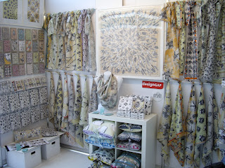
Firstly I started to look at Craig Fellows, who I saw the work of in Stockport Gallery a couple of Christmas' ago. I looked on his blog and thought that he displayed his work really well, he too has a mixture of different items and products on display that included, beautiful silk scarves, poster prints, cards, wrapping paper, cushions, and purses. I think that the reason that his display works so well because the colour palette is subtle and soft, another reason is that he has different groups of items together, such as the scarves and the cushions. Another thing that I think works really well is that he has displayed the items on different levels, he had hung the silk scarves quite high so they delicately drape down the wall, he has then placed items on a table and smaller boxes near the floor, creating lots of layers of interest.


The next artist/designer I looked at for inspiration was Katharine Watson, a print maker who specialises in block printing in particular. The reason the way she presents her work caught my eye was because she creates alot of cards and notebooks, which I thought were quite tricky to present. She has also quite a simple and folky feel about her work, and also looks as if she prints on to natural and rustic papers, which is something that I want to do in my work too. 


I like how the notebooks and cards have been displayed on shelves, not stacked or laid on a table, this means that people can see all the cards as a collection. I am not keen on the vibrant red back ground, I feel in a way it takes something away from the objects on display. 

I also wanted to try and create some wrapping paper to include in the show, however instead of just having sheets of wrapping paper just laid out, I thought it would be more interesting and realistic if I actually wrapped some boxes in the wrapping paper and then maybe tied some ribbon or string around. This would also be really good to photograph and then put in my portfolio too. 


Also one of my tutors gave me a great idea to include in my show, as I am doing work with rubber stamps, (as seen in my work for BMW) and I also want to include this style of working into this brief, it would be a good idea to have stamps laid out and then visitors could use the stamps to either stamp into a sketch book or I could even put blank cards out and they could then use the stamps to create their own card. I thought that this would be a great idea and would really get people involved in the show. I will have to think about this more and create some samples and maybe I could also talk to other people and see what they think, and would they get involved if they saw it in a show. 

V&A London

On the same day I went to the Natural History Museum later I went to the Victoria and Albert Museum because I have always been interested and wanted to go there but had never had the opportunity or time when in London previously. The V&A is the largest museums of decorative arts and design and has a huge collection of over 4.5 million objects. It has objects and artefacts from all over the world and from different centuries and eras, including Victorian, Edwardian, Post- war. And includes fashion, ceramics, furniture, jewellery, metal work, sculpture and textiles.


The first part of the museum I went to was fashion and textiles, I thought it was really interesting how they displayed the dresses and fashion pieces showing really early pieces from the Victorian period and then going through time and era's and had more modern fashion pieces. I loved the prints and the colours of the two dresses above in particular and also the silk scarf below, I thought that the prints were really simple but beautiful. 


As there was so much to look at and such a variety I was surprised as to what I found interesting and was drawn towards. I really loved looking a costumes and theatre design costumes and stage designs. I thought that they were really special and could recognise which show and theatre productions they were from. And the amount of skill and detail that goes into making these costumes. 


This was an exact replica of Kylie Minogue's dressing room, from one of her tours.

There were lots of costumes from both the theatre and pantomimes, including The Lion King, and lots of Shakespeare's plays.  


I was also really surprised that I found the ceramics so interesting, they had a huge selection of ceramics from all over the world and from different era's. These are a couple that I liked the most, the top left are ceramic tiles with one of William Morris' designs on. The other two I thought that the patterns, prints and colours were really beautiful and pretty.

I really enjoyed my afternoon and the V&A and would love to of back and see one of the special exhibitions, as a was a couple of days early to see the David Bowie exhibition, but I think I may be going back to London later in the year, so hopefully I will get the opportunity to go back and see it.


Natural History Museum London

On the last day in London I decided to go to the Natural History Museum, I thought it would be useful and help me in my work as I am looking at animals in particular birds, and I was getting bored of going to the Manchester Museum every time a new project came about, and the animal exhibition was under renovation. I went there mainly to look at the birds, but I also am interested in all different types of animals and insects and found myself wondering around the museum for ages.

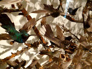
I thought that there would be more birds on display, but there was only a small selection that would be suitable for my needs, however I took some photographs that would be suitable for my work. I took photographs of any that I thought would fit into my work, so anything that I thought was a good shape or position, or that resembled a green parrot, (as the story I am working from isn't too specific on what type of parrot it is, just that it is a parrot and it is green) I was also looking at the colours of the birds, how the colours of their feathers blend and mix together and there are no harsh lines or areas where one colour changes into another.


I found this painting in the bird section and thought that the composition was really interesting, although they are all the same type or breed of bird and are all a similar size and the same colour, they all look different and interesting because they are in a different composition or position. I also like how the artist has include the branches, twigs and leaves, I think that this adds more interest and depth.
Like with the photographs I took in Manchester Museum I will use these photographs to sketch and draw from and hopefully they will help me draw some parrots for my designs and patterns for my final project. 

Tuesday, 26 March 2013

Erica Wakerly

On the second day in London we went to  meet the designer Erica Wakerly, who specialises in mainly wallpapers. She told us a brief history of where she studied and how she started, she told us that she did a degree in graphics, however she found the process of making and designing more interesting and also liked the idea of printing, so she then did a Masters in Printed Textiles. In 2006 she created the design Angle, which was one of her first big designs and is still probably her most popular to date.


She also told us about the processes she uses to create her works, like how she only likes screen printing and likes the tradition that goes into screen printing, and likes the quality and look that it gives. She also told us how she had tried digital but didn't like the look or effect it gave and went back the the tradition of screen printing. 
She also talked about how she creates the designs for the wallpapers and how she draws them. I thought how she creates the drawings was really interesting, and inspiring and something that I have never though of before. She told us that she creates small sculptures and models and then draws from them, this creates a more three demential drawing, therefore making them more interesting and have more depth. I think that this technique of making small models and sculptures and then drawing from them really translates into the drawings, you can see this in the wallpaper 'houses', where you can see that the houses are not flat they have been drawn from different angles and viewpoints, they have also been drawn with shadows. 


Another process that she uses to create her works was to create a college of different images and photographs and then drawing from this. This creates a more layered and dense image. You can see this process being used in the wallpaper 'homes', where the images collected were all from 1950's magazines and photographs. The drawings have been overlapped and layered on top of one another creating an interesting wallpaper, however it doesn't look too complicated as they are simple line drawings in black and white. 


She also talked about how she has had her wallpaper used, she mentioned how her wallpaper had been used in Topman across the country, also they have been used in bars and restaurants too, as often they want something different, unique and high quality. 
Like the visit to Timorous Beasties the previous day Erica also talked about how she doesn't follow trends, and instead does what she wants too and what inspires herself. I think that it's great that a designer has the courage to step out from the main stream and do what they are inspired to do instead. 

I think from Erica I have learnt not to be afraid of challenge myself and not to give up, I talked to her about my work and how I was finding repeating a pattern difficult and wondered if she had the similar problems when she first started, she told me that she did and it does take a lot of time and practice to get a repeat right. She said that even now it takes her along time, and I think that I was rushing repeats and have realised that they do take a long time to create and master. I have also learnt new techniques and have gotten ideas about drawing, just like when we were in first year and we made hybrid animals from found objects and recycled items, and then used these models to draw from later. 

Timorous Beasties Shop Visit

Last week a few of us from surface design and illustration went to London for a couple of days to meet some designers, and visit some galleries and museums. On the first day we were there we had a trip arranged to see the Timorous Beasties shop near Angel tube station. There we met Kate, who is the shop manager, she runs the shop where people can view and purchase the wallpapers and fabrics. I was really looking forward to this appointment, as I have become really interested in Timorous Beasties over the past few years, since I was first introduced to then in the first year of the degree. And I have found myself writing about them for numerous occasions, for both essays and blog posts, so I felt I had some knowledge of their style, influences and techniques.

Kate told us a brief history of Timorous Beasties and how all three of them had first met when studying at university together, and how they had worked together for a long time.
She also told us about how they don't follow trends, they aren't interested about what is going on in the mainstream textiles industry. I thought that this was really interesting and very brave of them, as most companies follow trends and fashion in interiors because this is most likely to make them more popular and more money. Whereas Timorous Beasties don't follow these trends, they are individual and do whatever they feel passionate about or are inspired by at that particular time.

Kate also told us about some of their new designs including the New York Toile, which I had never seen before and didn't know they that had created a new toile to add to their collection of previous toiles (Glasgow, Edinburgh, and London). Much like their other toiles it depicted images and famous scenery from New York, including people crossing busy roads, the statue of liberty, people sitting in central park, and the famous yellow taxi's. She told us that each of the scenes had been drawn by either Alistair or Paul on various trips to New York. These images and drawings were then turned into small scenes to make up the wallpaper design.

Kate also talked about the process and techniques that Timorous Beasties use to create their beautiful wallpapers and fabrics. She told us how they are still passionate about screen printing, and also keeping the tradition of having everything made and printed in the UK, which I think is really unique and a special tradition to keep alive, as the UK was at the forefront of printing and textiles in the past.
Aswell as the traditional screen printing they also use digital printing as they can introduce much more colour, fine detail and intricacy into their designs, as this couldn't be achieved with screen printing.

Aswell as new deigns such as the New York Toile, they have also been creating beautiful and intricate nets, creating a fresh and interesting take on something that is possibly seen as outdated or old fashioned. The nets are also being produced and made in one of the last lace and net companies in the UK, again they have thought about producing the items in the British tradition.

In the shop there was also a large selection of cushions, mugs, and plates that had a selection of their most famous prints on, such as the bee, a scene from a toile or a butterfly. I really liked the section of ceramics that they had produced and has really inspired me into looking at putting some of my designs onto ceramics for the final show at the end of the year.


I think that one of my favourite collections in the shop was the Ruskin collection, it included lots of different beautiful and interesting exotic birds. 

Overall I really enjoyed meeting Kate and listening and learning from her, and getting an idea of the industry and what it is like to be a designer. I have also learnt that you don't always have to be 'safe' with you designs it's good to step outside the box and don't be afraid to be different and take chances and risks. And to find something that truly inspires you rather than doing it because you feel you have too, because if you produce something that you are interested and passionate about then that passion and interests will translate into your work and designs. I feel that from this visit I have gone away with alot of motivation, and have gone away with a lot of tips and more knowledge on the industry.

Monday, 25 March 2013

Lord Whitney

A while ago we had a visit from Lord Whitney, who set us an small and interesting brief. I know the illustrators have been given briefs and worked with Lord Whitney before, but it was something new for the surface designers. The brief they gave us said that we could spend as much or as little time on it as we wanted, it could be only a couple of hours or a few days, also it wasnt meant to be thought and fussed about too much, it was meant to be a sort of escape from our final project, which I thought was a good idea, as sometimes you can become too wrapped up in your current work and just need to get away and take some time away and then come back to it later on. I think that the illustrators have had similar briefs in the past, were they only last for a couple of days or so, however it was a first for the surface designers, so I wasn't sure how I would react and work on this brief as I have a tendency to sometimes over think and plan things too much. 
The brief said that we should illustrate any of Edward Lear's nonsense poems, the poem I chose was;


There was an old man of Dumbree,
Who taught little owls to drink tea;
For he said, 'To eat mice,
Is not proper or nice'
That amiable man of Dumbree.
I started by drawing the cups, mugs and teapots using a black fineliner. 

I then decided to make the owls, I stated by cutting out basic owl shapes from found paper, then drew on top using black fine-liner. I wanted each to have their own personality and to each look different from one another, so some are cute and friendly where as other look moody or sleepy. 

I then stated to draw the mouse, I ripped a piece of grey paper and then drew the basic mouse shape and some cheese using fine liner. I drew his happy because he's meant to be safe from the owls. I think the mouse is my favourite element.

I then had to find away of combining all the different elements together, so I jumped on photoshop, scanned in my drawings and then layered and combined them together, and this was the end result. 


Overall I really liked the outcome, I think there could have been a few things to improve on, such as the drawing style and using different materials and techniques to draw with, however because it was only over a couple of days I'm proud of it. I think it has shown me how much work I can actually produce in only a couple of days. I also think it has helped me to have more freedom in my work and not plan out and over think too much.