Showing posts with label Places Visited. Show all posts

Wednesday, 27 March 2013

V&A London

On the same day I went to the Natural History Museum later I went to the Victoria and Albert Museum because I have always been interested and wanted to go there but had never had the opportunity or time when in London previously. The V&A is the largest museums of decorative arts and design and has a huge collection of over 4.5 million objects. It has objects and artefacts from all over the world and from different centuries and eras, including Victorian, Edwardian, Post- war. And includes fashion, ceramics, furniture, jewellery, metal work, sculpture and textiles.


The first part of the museum I went to was fashion and textiles, I thought it was really interesting how they displayed the dresses and fashion pieces showing really early pieces from the Victorian period and then going through time and era's and had more modern fashion pieces. I loved the prints and the colours of the two dresses above in particular and also the silk scarf below, I thought that the prints were really simple but beautiful. 


As there was so much to look at and such a variety I was surprised as to what I found interesting and was drawn towards. I really loved looking a costumes and theatre design costumes and stage designs. I thought that they were really special and could recognise which show and theatre productions they were from. And the amount of skill and detail that goes into making these costumes. 


This was an exact replica of Kylie Minogue's dressing room, from one of her tours.

There were lots of costumes from both the theatre and pantomimes, including The Lion King, and lots of Shakespeare's plays.  


I was also really surprised that I found the ceramics so interesting, they had a huge selection of ceramics from all over the world and from different era's. These are a couple that I liked the most, the top left are ceramic tiles with one of William Morris' designs on. The other two I thought that the patterns, prints and colours were really beautiful and pretty.

I really enjoyed my afternoon and the V&A and would love to of back and see one of the special exhibitions, as a was a couple of days early to see the David Bowie exhibition, but I think I may be going back to London later in the year, so hopefully I will get the opportunity to go back and see it.


Natural History Museum London

On the last day in London I decided to go to the Natural History Museum, I thought it would be useful and help me in my work as I am looking at animals in particular birds, and I was getting bored of going to the Manchester Museum every time a new project came about, and the animal exhibition was under renovation. I went there mainly to look at the birds, but I also am interested in all different types of animals and insects and found myself wondering around the museum for ages.

I thought that there would be more birds on display, but there was only a small selection that would be suitable for my needs, however I took some photographs that would be suitable for my work. I took photographs of any that I thought would fit into my work, so anything that I thought was a good shape or position, or that resembled a green parrot, (as the story I am working from isn't too specific on what type of parrot it is, just that it is a parrot and it is green) I was also looking at the colours of the birds, how the colours of their feathers blend and mix together and there are no harsh lines or areas where one colour changes into another.


I found this painting in the bird section and thought that the composition was really interesting, although they are all the same type or breed of bird and are all a similar size and the same colour, they all look different and interesting because they are in a different composition or position. I also like how the artist has include the branches, twigs and leaves, I think that this adds more interest and depth.
Like with the photographs I took in Manchester Museum I will use these photographs to sketch and draw from and hopefully they will help me draw some parrots for my designs and patterns for my final project. 

Tuesday, 26 March 2013

Erica Wakerly

On the second day in London we went to  meet the designer Erica Wakerly, who specialises in mainly wallpapers. She told us a brief history of where she studied and how she started, she told us that she did a degree in graphics, however she found the process of making and designing more interesting and also liked the idea of printing, so she then did a Masters in Printed Textiles. In 2006 she created the design Angle, which was one of her first big designs and is still probably her most popular to date.


She also told us about the processes she uses to create her works, like how she only likes screen printing and likes the tradition that goes into screen printing, and likes the quality and look that it gives. She also told us how she had tried digital but didn't like the look or effect it gave and went back the the tradition of screen printing. 
She also talked about how she creates the designs for the wallpapers and how she draws them. I thought how she creates the drawings was really interesting, and inspiring and something that I have never though of before. She told us that she creates small sculptures and models and then draws from them, this creates a more three demential drawing, therefore making them more interesting and have more depth. I think that this technique of making small models and sculptures and then drawing from them really translates into the drawings, you can see this in the wallpaper 'houses', where you can see that the houses are not flat they have been drawn from different angles and viewpoints, they have also been drawn with shadows. 


Another process that she uses to create her works was to create a college of different images and photographs and then drawing from this. This creates a more layered and dense image. You can see this process being used in the wallpaper 'homes', where the images collected were all from 1950's magazines and photographs. The drawings have been overlapped and layered on top of one another creating an interesting wallpaper, however it doesn't look too complicated as they are simple line drawings in black and white. 


She also talked about how she has had her wallpaper used, she mentioned how her wallpaper had been used in Topman across the country, also they have been used in bars and restaurants too, as often they want something different, unique and high quality. 
Like the visit to Timorous Beasties the previous day Erica also talked about how she doesn't follow trends, and instead does what she wants too and what inspires herself. I think that it's great that a designer has the courage to step out from the main stream and do what they are inspired to do instead. 

I think from Erica I have learnt not to be afraid of challenge myself and not to give up, I talked to her about my work and how I was finding repeating a pattern difficult and wondered if she had the similar problems when she first started, she told me that she did and it does take a lot of time and practice to get a repeat right. She said that even now it takes her along time, and I think that I was rushing repeats and have realised that they do take a long time to create and master. I have also learnt new techniques and have gotten ideas about drawing, just like when we were in first year and we made hybrid animals from found objects and recycled items, and then used these models to draw from later. 

Timorous Beasties Shop Visit

Last week a few of us from surface design and illustration went to London for a couple of days to meet some designers, and visit some galleries and museums. On the first day we were there we had a trip arranged to see the Timorous Beasties shop near Angel tube station. There we met Kate, who is the shop manager, she runs the shop where people can view and purchase the wallpapers and fabrics. I was really looking forward to this appointment, as I have become really interested in Timorous Beasties over the past few years, since I was first introduced to then in the first year of the degree. And I have found myself writing about them for numerous occasions, for both essays and blog posts, so I felt I had some knowledge of their style, influences and techniques.

Kate told us a brief history of Timorous Beasties and how all three of them had first met when studying at university together, and how they had worked together for a long time.
She also told us about how they don't follow trends, they aren't interested about what is going on in the mainstream textiles industry. I thought that this was really interesting and very brave of them, as most companies follow trends and fashion in interiors because this is most likely to make them more popular and more money. Whereas Timorous Beasties don't follow these trends, they are individual and do whatever they feel passionate about or are inspired by at that particular time.

Kate also told us about some of their new designs including the New York Toile, which I had never seen before and didn't know they that had created a new toile to add to their collection of previous toiles (Glasgow, Edinburgh, and London). Much like their other toiles it depicted images and famous scenery from New York, including people crossing busy roads, the statue of liberty, people sitting in central park, and the famous yellow taxi's. She told us that each of the scenes had been drawn by either Alistair or Paul on various trips to New York. These images and drawings were then turned into small scenes to make up the wallpaper design.

Kate also talked about the process and techniques that Timorous Beasties use to create their beautiful wallpapers and fabrics. She told us how they are still passionate about screen printing, and also keeping the tradition of having everything made and printed in the UK, which I think is really unique and a special tradition to keep alive, as the UK was at the forefront of printing and textiles in the past.
Aswell as the traditional screen printing they also use digital printing as they can introduce much more colour, fine detail and intricacy into their designs, as this couldn't be achieved with screen printing.

Aswell as new deigns such as the New York Toile, they have also been creating beautiful and intricate nets, creating a fresh and interesting take on something that is possibly seen as outdated or old fashioned. The nets are also being produced and made in one of the last lace and net companies in the UK, again they have thought about producing the items in the British tradition.

In the shop there was also a large selection of cushions, mugs, and plates that had a selection of their most famous prints on, such as the bee, a scene from a toile or a butterfly. I really liked the section of ceramics that they had produced and has really inspired me into looking at putting some of my designs onto ceramics for the final show at the end of the year.


I think that one of my favourite collections in the shop was the Ruskin collection, it included lots of different beautiful and interesting exotic birds. 

Overall I really enjoyed meeting Kate and listening and learning from her, and getting an idea of the industry and what it is like to be a designer. I have also learnt that you don't always have to be 'safe' with you designs it's good to step outside the box and don't be afraid to be different and take chances and risks. And to find something that truly inspires you rather than doing it because you feel you have too, because if you produce something that you are interested and passionate about then that passion and interests will translate into your work and designs. I feel that from this visit I have gone away with alot of motivation, and have gone away with a lot of tips and more knowledge on the industry.

Wednesday, 20 February 2013

Glam!, Tate Liverpool

A while ago I went to the Tate in Liverpool to see the new Glam! The Performance of Style  Exhibition. An exhibition that explored the power and the popularity of glam in the sixties and seventies. A time when fashion, music and art were fusing and working together, and included what was known as the "in crowd" that included musicians, artists and models, people who were known for their spontaneous fashion and the way they stood out from the crowd with the way they were dressed and their style.
The show had a large collection of items including paintings, installations, sculpture, music posters, prints, photography, moving image, short films, fashion, and vinyl art.
When walking into the show you are welcomed by influential music that was popular in the 60's and 70's, you then notice the colour and vibrancy of the walls, painted a bright fuchsia pink, and the walls covered in photographs, music posters and vinyl records.
Artists that were included were of course Andy Warhol, one of the most significant and influential artists during the period. It also included some of Richard Hamilton's collages, and a David Hockney painting.
It also included some musical artists who were in the height of their career during the 60's and 70's, including David Bowie, Iggy Pop, The Rolling Stones, Alice Cooper, New York Dolls, Debbie Harry, and Lou Reed. I loved seeing the photographs and the contrast of the artists performing live and then the glamour and beauty of them in photoshoots, for magazines and album covers.
One of my favourite parts of the exhibition were the photographs of David Bowie, there were some that I had never seen before and thought that they were really beautiful, and because his appearance was constantly changing, no two did he look the same.


I think I was only disappointed that there wasn't more fashion and clothing items in the exhibition, I would have thought that there would have been much more fashion included in the exhibition as it was such an important  and memorable part of this era, and the fashion was very interesting and flamboyant. There was a few fashion garments in the show, one worn by Brian Eno, there was also a couple of sketches of designs for garments by Ossie Clarke that I thought were really interesting. Also, there was the painting 'Mr and Mrs Clarke and Percy' by David Hockney.


Friday, 23 November 2012

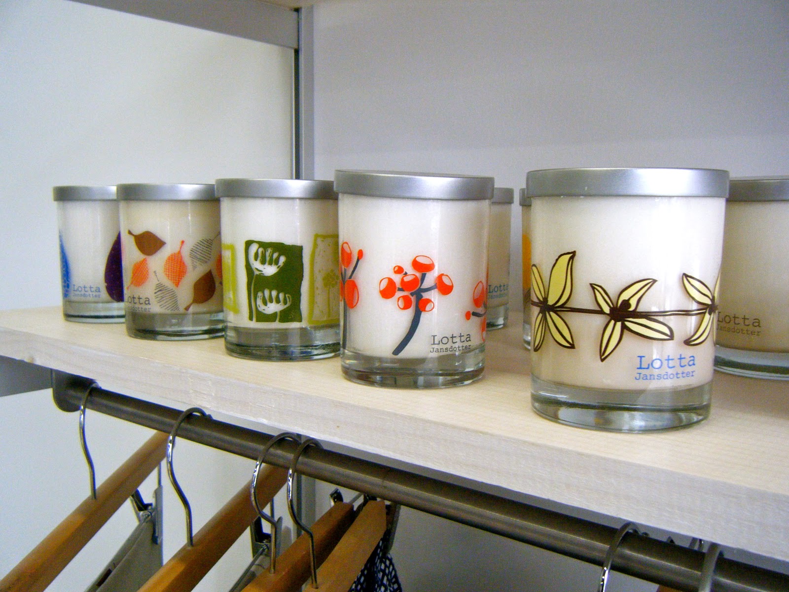
Lotta Jansdotter

One of the Surface Design group had arranged a visit to see Lotta Jansdotter's Studio and Shop in Brooklyn. Unfortunately Lotta couldn't be there as she was away with business however the shop manager was there to talk to us, answer any questions and talk us around the studio and shop.


The shop space was clean, fresh and had an exciting atmosphere, it was painted white so that all the colours and patterns of the products stand out from the bright white backgrounds. 


I really loved the simple and fresh patterns of her work, the patterns were bold, but also mixed nature and organic shapes with the bold shapes. I think my favourite pieces of work were the blue/teal collection (above). I really loved the colours, the mixture of blues and the clean white, with a mixture of bold shapes and organic shapes. 
I was really inspired by the way the work was presented in the shop, as I want to make things and put my designs onto products in the final year I got lots of inspiration and ideas from, as sometimes I think that it is difficult to place and arrange difficult objects like these, as sometimes it can become too over crowded and cluttered, making it look messy and unprofessional. However I really liked the mixture of objects on tables and then things on shelves above.  
The studio manager told us that because she creates things now on such a large scale that she no longer does all the printing herself instead it is done offsite, however if she is sampling or coming up with ideas then she will screen print herself. 

I found the studio to be really inspirational too, there was no real separation between the shop and studio, I thought that this was really interesting and something I have never really seen before, to this scale. I found it really sweet how her aprons, stamps and screens had been left out as if she had been working there only a few hours ago. 


Stephen Byram

Also on the first full day of New York we went to the house of Stephen Byram in Jersey. He was so welcoming and friendly letting us into his house, and to see some of his older works and some of his most recent works.
He has a variety of different styles and techniques, collage, line drawing and some abstract works, what I really found interesting was that a lot of his work has been used on CD covers, I thought that this would be an amazing feeling for an artist to see their work on a CD. He had placed some of his CD covers, posters and other works around his house for us to pick up and look at/through and didn't mind us taking photo's of his house and work. He said that in some ways he has moved on from the CD covers because they don't have the same feel to them any more because of the internet, downloading and iTunes, as the picture is so small and tiny on an iPod people don't care anymore or take the time to look and appreciate the work and attention that goes into music/album artwork.


His studio in the basement

In some of his more recent works he has moved onto 3D sculptures made from found objects and recycling materials and objects (mainly wood) to create something new and exciting. He seemed really excited and proud talking about his new works as they are so different and refreshing from his work for CD's. He calls himself a graphic designer, however he seems to have so many layers to his works, in some works he is definitely a graphic designer looking at typography, shape and layout, in some ways his works look like an illustrator and painter and then in others you can see the sculpture 3D elements in his creations, all really interesting and appealing.

The Invisible Dog/ Andre Da Loba

On our first full day in New York we got the subway to Brooklyn to visit the Invisible Dog Art Centre.   We were welcomed by Andre Da Loba, (one of the artist's who has a studio space there.)
We started by looking around the current exhibition, by the duo Steven and William. The Art Centre was an old factory/mill that use to make jewellery, and belt buckles, so when the Art Centre was made a lot of objects were left there, so many of the works were made by recycling this unused and found items. 


There were also some wonderful repeat patterns and drawings another room, (I think that they were by the same people, although they seem completely different from their other works). But as I am a surface designer they really caught my eye, because of the repeating patterns, the simple colours in the background, and that there were multiples of the same thing (my favourite). 


Andre Da Loba 

Once we had looked around the exhibition of Steven and William, we then went upstairs, in a huge old lift, which said 'Danger' all over it (not very reassuring), and went to see some of the artists studio's. A real privilege as I think that many artist's and designers are private and secretive when it comes to their studio spaces.
Andre's studio was amazing and inspiring filled with his work, objects and artefacts that he has collected over the years. What I found interesting was he about of colour and variety in his works, from 3D and sculpture to drawings and prints. I really made me think about my own studio space and how I should make full use of the amount of space I have while I am still at Stockport.
It has also made me think about the importance of a studio space and how it is a place where an artist can escape from their houses and bedrooms too, and it should be a place of randomness and artistic mess and chaos.


The works that I really liked was the prints/paintings of the houses and buildings, I thought that they were beautiful each once a different colour, shape and size.