Showing posts with label Brief. Show all posts

Monday, 25 March 2013

Lord Whitney

A while ago we had a visit from Lord Whitney, who set us an small and interesting brief. I know the illustrators have been given briefs and worked with Lord Whitney before, but it was something new for the surface designers. The brief they gave us said that we could spend as much or as little time on it as we wanted, it could be only a couple of hours or a few days, also it wasnt meant to be thought and fussed about too much, it was meant to be a sort of escape from our final project, which I thought was a good idea, as sometimes you can become too wrapped up in your current work and just need to get away and take some time away and then come back to it later on. I think that the illustrators have had similar briefs in the past, were they only last for a couple of days or so, however it was a first for the surface designers, so I wasn't sure how I would react and work on this brief as I have a tendency to sometimes over think and plan things too much. 
The brief said that we should illustrate any of Edward Lear's nonsense poems, the poem I chose was;


There was an old man of Dumbree,
Who taught little owls to drink tea;
For he said, 'To eat mice,
Is not proper or nice'
That amiable man of Dumbree.
I started by drawing the cups, mugs and teapots using a black fineliner. 


I then decided to make the owls, I stated by cutting out basic owl shapes from found paper, then drew on top using black fine-liner. I wanted each to have their own personality and to each look different from one another, so some are cute and friendly where as other look moody or sleepy. 

I then stated to draw the mouse, I ripped a piece of grey paper and then drew the basic mouse shape and some cheese using fine liner. I drew his happy because he's meant to be safe from the owls. I think the mouse is my favourite element.

I then had to find away of combining all the different elements together, so I jumped on photoshop, scanned in my drawings and then layered and combined them together, and this was the end result. 


Overall I really liked the outcome, I think there could have been a few things to improve on, such as the drawing style and using different materials and techniques to draw with, however because it was only over a couple of days I'm proud of it. I think it has shown me how much work I can actually produce in only a couple of days. I also think it has helped me to have more freedom in my work and not plan out and over think too much. 

Thursday, 20 December 2012

BMW Warm Heart Foundation

Over the past couple of months I have been working on BMW warm heart foundation brief. The foundation has been set ip by BMW to provide funding and support for educational, environmental and Cultural Heritage projects. They would like the designs to portray uplifting and positive themes such as, hope, light, role models, looking up to elders, growth, helping, caring, realising dreams ect. I decided that I would focus on growth, caring and light, so the first images that came to my head were plants and flowers. We were told that we should create a certificate, thank you/new year card and two of the following; bag, scarf, keyring, iPhone case, mug, t-shirt.

I decided that I would start by looking at colours, as this is an important part of chinese culture and art, as different colours portray different things, such as yellow is sunlight, and growth and harmony, so I knew that this would be a good colour to chose as it goes with my themes. 
I then decided to look at flowers and plants as this would be the main image of my chosen theme. I found that sunflowers mean New Year, and yellow is a good colour. Bamboo is also a popular plant and is often symbolised with China and Chinese culture. 
I then started to draw sunflowers drawn from life, so I could draw from different angles and viewpoints. Next talking my initial drawing as inspiration I then started to break down the shapes and simplify the drawings, as I wanted to turn them into stamps. 

Drawing with Black Fine liner 
Stamps

I then wanted to look at backgrounds, and it was suggested by one of my tutors to try collage, collage is something that I have always been interested in and have produced in the past, however I have stopped making them over the past couple of years. I dived back into collaging and have definitely caught the collage bug again.


Here are a couple of the collages I made to create backgrounds with, I used paper, card, painted papers, and printed papers using silk screen printing. I knew that I wanted the colours of the backgrounds and the stamps to compliment each other, but also so the stamps stand out from background. I decided that I would stick to a colour palette of greens, yellows and blues so everything would compliment each other well. 

I then went on Photoshop to put the two components together. 
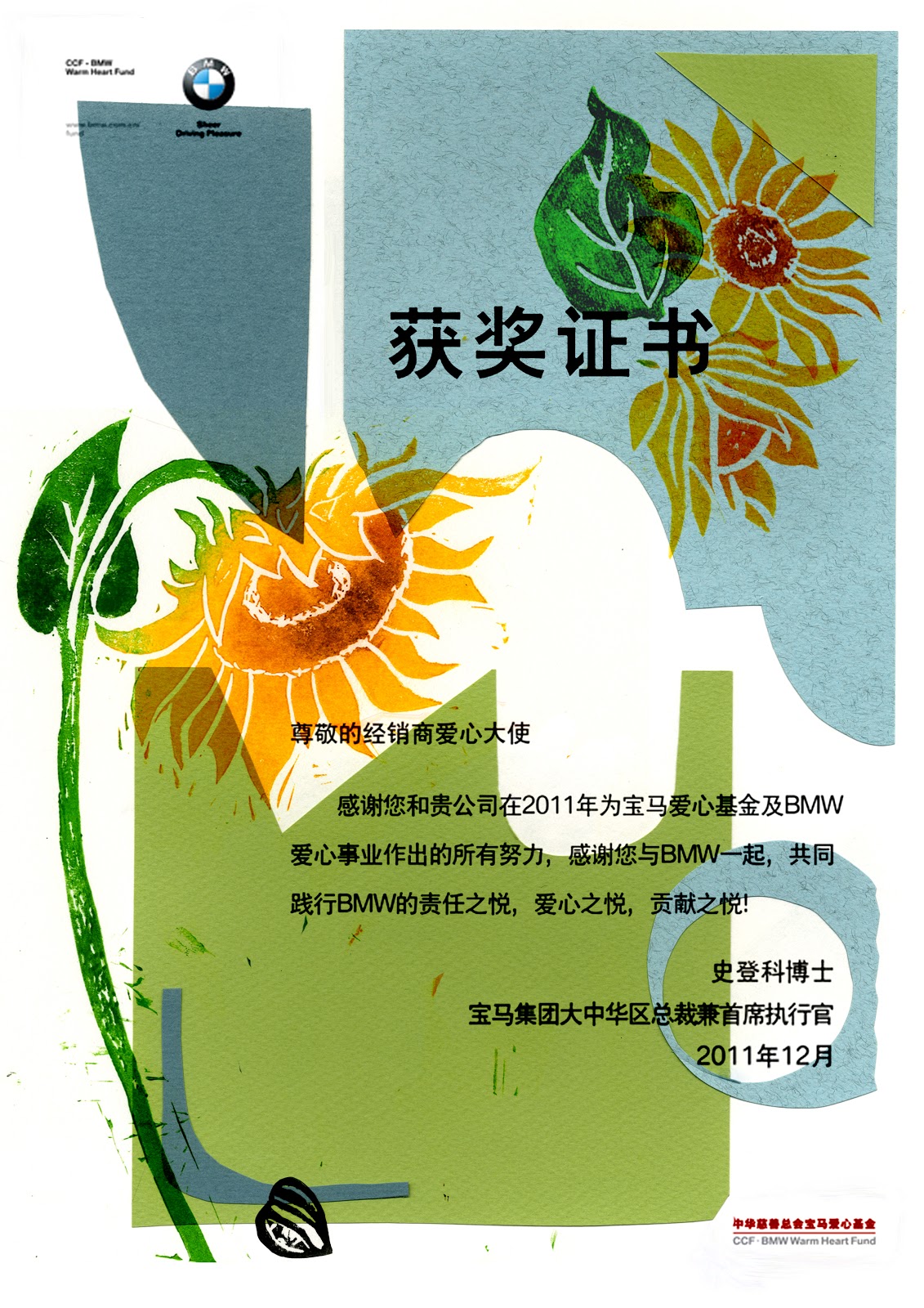
Certificate 

Tote Bags

Overall this has been one of my favourite briefs to date, although I was quite slow to start and get all my ideas and thoughts together, I was really pleased with the style, techniques, and the final outcome. I think that I have learnt a lot from this brief, most of all to sort my ideas out first, rather than going off and drawing any old think/flower and drawing lots of unnecessary things, it would be much better and much more productive if I got all my ideas and thoughts together first. I have also found an interesting way of working and feel as I could take this further and develop it more in the future. 

Wednesday, 5 September 2012

New Year, New Project

As I move into my third year of University I was given a choice of five briefs I found it difficult to choose one, at fist I was draw to one about the relationship between man and animals, but then for a little inspiration I started to look though a sketch book I had filled with photographs and sketches from the University trip to Poland and was immediately drawn to the old, tall and unusual buildings. So decided on the Le Flâneur brief, as I thought that this would be best for my ideas.
Le Flâneur is a French word, which literally means the stroller, the dawdler. 

For my work I want to concentrate on older interesting buildings often found in Europe, such as Poland, France and Italy, for research unfortunately I cannot visit these places, but have photo's from Poland and can gather more from the internet and books. I love European townhouses, each one painted different colours, each one with different styles of windows and doors and each one unique and  different form each other. 


Ideas:
  • Instead of doing detailed, intricate drawings I want to do simple line drawings, using a fine liner, fountain pen and continuous line drawings. 
  • Last year I became interested in watercolours and want to translate this into this brief. 
  • Drawing one area of the building, such as a window and draw different shapes, styles and sizes repetitively. 
  • Look for interesting smaller parts of building such as different types bricks, letter box, door bells or door numbers.